

🎉 The dashboard has been updated to include data from 2021
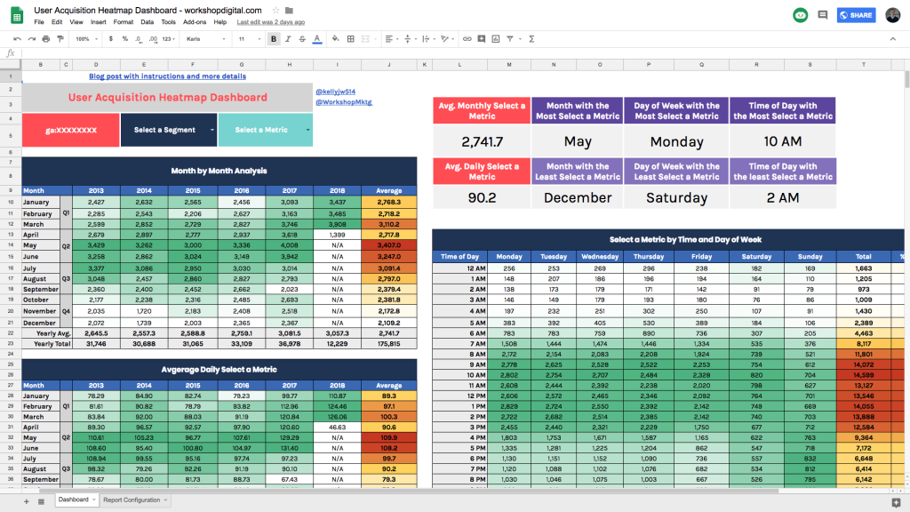
- On average, how many daily visitors does my site get from organic search?
- What time of day are paid and organic users most likely to convert?
These are great questions, but these data points aren’t readily available in Google Analytics. You really have to work to get that number by exporting and manipulating the data. We had hoped that the new “Intelligence” feature or the “Home” dashboard in Google Analytics would solve these problems, but we weren’t so fortunate.

Well, I got fed up with manually pulling these reports from Google Analytics and decided to build a custom dashboard in Google Sheets with the Google Analytics API. This dashboard can easily answer all of these questions with the click of a button:
- Which month gets the most traffic?
- Which month gets the least traffic?
- What time of day do most conversions happen?
- What day of the week does the blog get the most traffic?
- How many average daily visitors does the site get?
- How many average monthly visitors does the site get?
These aren’t just questions I’m curious about either. These are common questions that we get from clients as we build out a digital strategy.
If you already know how to use the Google Analytics API Add-On for sheets—and know exactly why and how you would use this dashboard to create a killer SEO strategy—make a copy of my dashboard and enjoy the data!
Download my outdated dashboard
If you’re not as familiar with the Google Analytics Add-on, or you’re unsure how to use this dashboard, continue reading to learn how to set up everything up.
How to Use the Heatmap
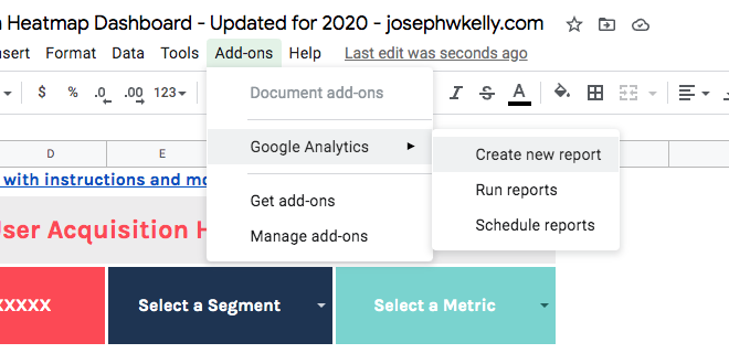
If you haven’t already, install the Google Analytics Spreadsheet Add-0n. Then, go to our User Acquisition & Behavior Patterns Google sheet and make a copy by going to File > Make a copy. This will create a personal version of the dashboard and allow you to make changes and edits to the sheet.
Pro Tip: Before you go any further, make sure the Google login you use to download the dashboard has access to your Google Analytics accounts; otherwise, you won’t be able to run any reports.
How to Configure Your Google Analytics Heatmap
1. Enter your Google Analytics View ID with “ga:” in front of the ID. You can find your View ID in the Google Analytics interface under Admin > View > View ID.
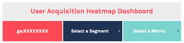
2. Select the segment and metric you’d like the report to use for your analysis.
I’ve already included commonly used segments and metrics. If there are custom segments or additional metrics you’d like to use, unhide the “Segments” and “Metrics IDs” sheets and add anything that you want the report to include.
Pro Tip: If you need to figure out the ID for a metric or segment, use Google Query explorer. Click on a field to type in the metric or segment you want to use, then hit enter to return the ID.
3. Click “Run reports” under the “Add-ons” menu. You should get a pop-up saying 13 reports were successfully completed.
Run, Analyze, Learn, Take Action
Once the reports have run successfully, everything will populate on its own, and you’ll be able to analyze your data by month, day of the week, and hour of the day.
Did you find a good use case for the dashboard? Can you think of a way I can improve the dashboard? Let me know! Tweet me: @kellyjw514.
Check out the other Google Analytics dashboards I’ve made using the Google Analytics Add-On for Sheets: